
Friday, May 18, 2012


Thursday, April 26, 2012
Homework 13.2 How To Create Eroded Metal Text

The student version of Photoshop doesn't have couple filters that the tutorial use http://psd.tutsplus.com/tutorials/text-effects-tutorials/eroded-metal-text-photoshop/ so the outcome looks different then the tutorial. I also changed to a lighter background.


Home Work 11 - A Picture Worth A Thousand Words

Wednesday, April 25, 2012
Home Work 10 Surrealism

Midterm Project Historical Collage

I found out the 'gradient tool' is a useful tool to create mask in this project, especially the gradient blending from black and transparency. It allows you to create different shapes of blending with multiple passes. I also found that adjusting opacity sometimes can create cool effect like the Great Wall background showing through the scroll.
Sunday, April 1, 2012

Monday, March 12, 2012
Home work 4 - Color Scheme


Home Work 4 - Part 2b - Correcting with Curves
Lesson 6:
2. Correcting with Curves P. 205
2. Correcting with Curves P. 205
 |
| Original Image |
 |
| Corrected Image |
Home Work 4 - Part 2a - Adjusting Brightness Levels
Lesson 6:
1. Adjusting Brightness Levels P. 195
1. Adjusting Brightness Levels P. 195
 |
| Corrected Image |
 |
| Original Image |
Saturday, March 10, 2012
Home Work 3 - Duotone
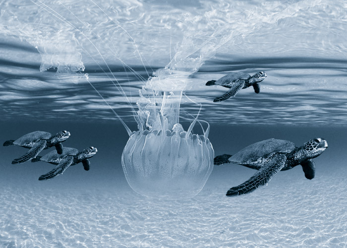
Working on this project, I realized that I didn't take much scenic pictures. I need to start taking more scenic photos. I also found out that just using two colors can create really cool effect. I think this under water duotone effect has greater impact then full color.
Subscribe to:
Comments (Atom)